

Last year was a great one for video games. From some of the amazing connected experiences, to to the gorgeous visuals, to the novel “New Gen” smell of the consoles, 2014 turned out to be a fun ride for gamers. In fact, technology advanced far enough for many of us to make the switch to digital purchases of our games. But with retail still an important factor for the foreseeable future, box art still needs to be eye-catching and exciting. We’ve asked good friend and fellow designer Justin Russo to take a look at the video game box art of 2014 for his expert opinion. Have a look below at what he thinks was the cream of the critical crop, and why.
In past years there were almost always pretty clear winners were I to put together a top ten of box art design, but this year a lot of it was pretty safe and boring. That isn’t to say any of it was particularly bad design — no one box art really did much to stand out from the crowd. It was a lot of “protagonist looking broody holding a gun”, lots of smoke, lots of gray, lots of blah, which I feel is pretty representative of the state of the industry itself.
In years past, when we saw publishers take chances with box art there was a certain swagger or confidence. Resistance 3 comes to mind: a pretty robust and critically lauded game that featured some pretty unconventional artwork, the kind usually reserved for the all too pervasive collector’s editions. It was a publisher showing confidence in their work, but letting their art department push the boundaries a little bit.
Before I go into the highlights of this past year in box art, as a designer myself I feel that its pretty important to break down the three conceits to consider when determining what exactly video game box art has to do.
First and foremost, it has to give an all together brief break down of what to expect from the game. This is why men with guns are so pervasive (to let you know that in the game, you’ll be a man and you’re going to be shooting guns). Look no further the box art for 2013’s Bioshock Infinite for a classic example of this scenario. How could you possible portray the rich complexity of Bioshock’s world in a single image? Simple: you don’t. You show a man with a gun. This is no fault of the game makers mind you, but the realities of marketing a million dollar product. People like games with men who shoot guns, so please, show us a man who shoots guns.
Secondly, once the initial conceit is grasped, use the box art to convey an attitude or general mood. This is where the smokey grittiness comes in, or as in the case of Sunset Overdrive, where you plaster you fun graphics and a comic-style look. Sell the public on how you want them to feel when they play your game. Combined with the first conceit, this is also where you run into the unfortunately popular sexualization of women (Bayonetta 2’s ass-first approach to box art comes to mind).
Last, sprinkle in your details. Hint at some of your higher level features or fun weapons you might be able to use while you’re playing. This is where Mario Kart 8 and Smash Bros. thrive, showing as many characters as they can cram on that little rectangle. Sunset Overdrive also benefits enthusiastically here.
At the end of the day, box art is used to sell a game. It’s decided by publishers, developers and of course marketing departments based on years of retail study. They figure out who their target market is and then design their cover from there. Whether you agree with that approach or not, it’s how its done and likely how it will be done for the foreseeable future.
Now lets take a look at some of 2014’s highlights:
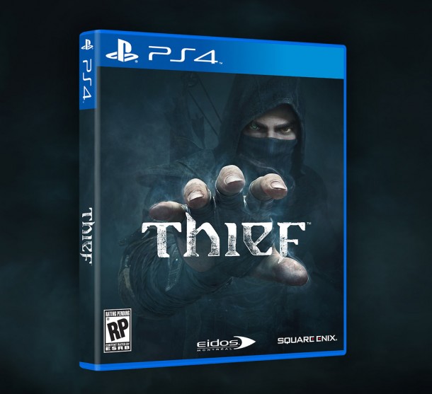
Thief – Here’s a cover that could have easily walked down the path of showing a silhouette of the protagonist, maybe holding a knife or bow and arrow, maybe crouched on rooftop, blah blah blah. But for as straightforward as this cover is, it’s remarkably subtle. It barely features the protagonist, focusing instead on the fingers and the eyes almost reaching out at us from the box. Then underneath those it layers the bow and arrow, the hood, the mask, all through the glowy smoky typeface that he’s reaching out for as if to snatch it away and take off into the shadows.
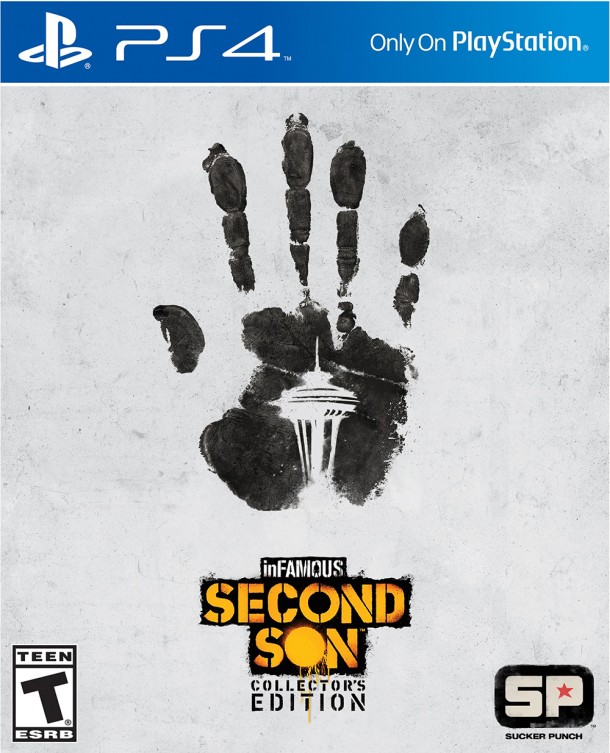
Infamous Second Son Collector’s Edition – Here is a solid example of the collector’s edition always having a much more designerly aesthetic. It doesn’t feature anything too fancy or too graphic, just ultra-simple shapes and a little hidden nod to the setting itself. Sucker Punch always has a little fun with their artwork, and this is no exception.
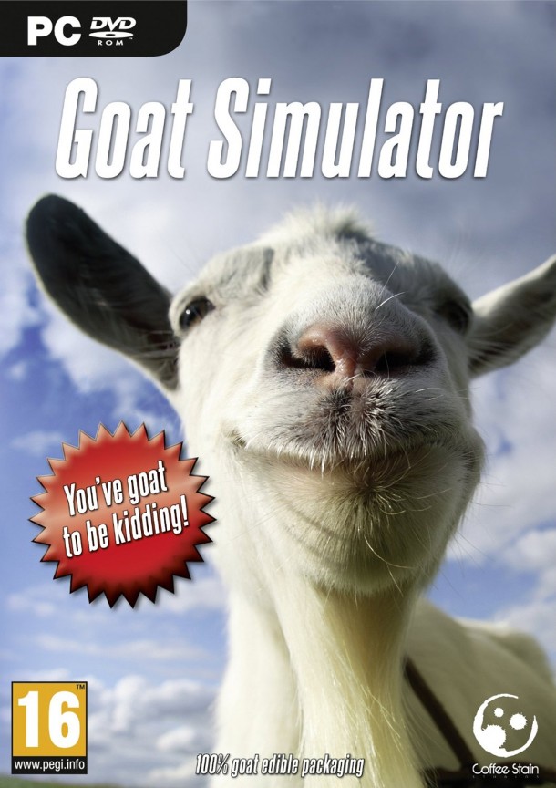
Goat Simulator – At first glance you might think, “Why is this remarkable? It’s boring”. Exactly. There’s a bit of an established template when making any game that falls under the “simulator” banner, whether it’s a truck, a plane or a goat: Big glamour shot of the main thing that is being simulated, blue sky in the background, simple sans-serif type treatment. So if Tank Simulator or Farming Simulator follows that same look, why shouldn’t Goat Simulator? But this one has a goat.
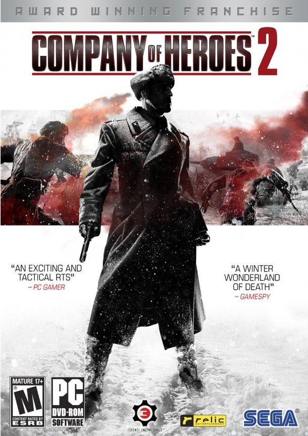
Company of Heroes 2 – Here is a pretty classic example of the straightforward video game box art template. You got a dude with a gun, you’ve got some smoke and some war machines in the background and a nice aggressive title treatment. Why this stood out to me is probably more for personal taste than anything else. I really like white backgrounds and minimal use of color. When you’re staring at a wall of video game boxes, what is going to stand out more than plain black and white with a little pop of red? Next time you’re at Gamestop, try it out.
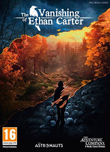
The Vanishing of Ethan Carter – Much in the same way that small independent titles are subverting the established paradigm of the big giant corporate publisher, they’re also subverting our expectations for box art. When a game made on a shoe string budget only has to sell a handful of copies to break even or make money, they can play a little more fast and loose with their box art. This cover quite literally invites you in for a closer look, asking you to peel back the layers.
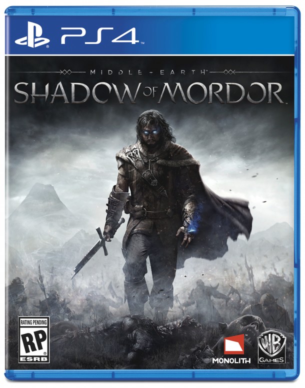
Middle-earth: Shadow of Mordor – Here is another pretty classic by-the-books video game box. The reason why this stood out to me is actually pretty surprising. Where does it say “Lord of The Rings” on this cover? Nowhere. It’s kind of shocking that they are sitting on this (pardon the pun) monolith brand and not even bothering to show it off a bit more. It actually speaks quite well to WB’s confidence in their product and being able to deliver that world in a game not within the Hobbit or LOTR films.
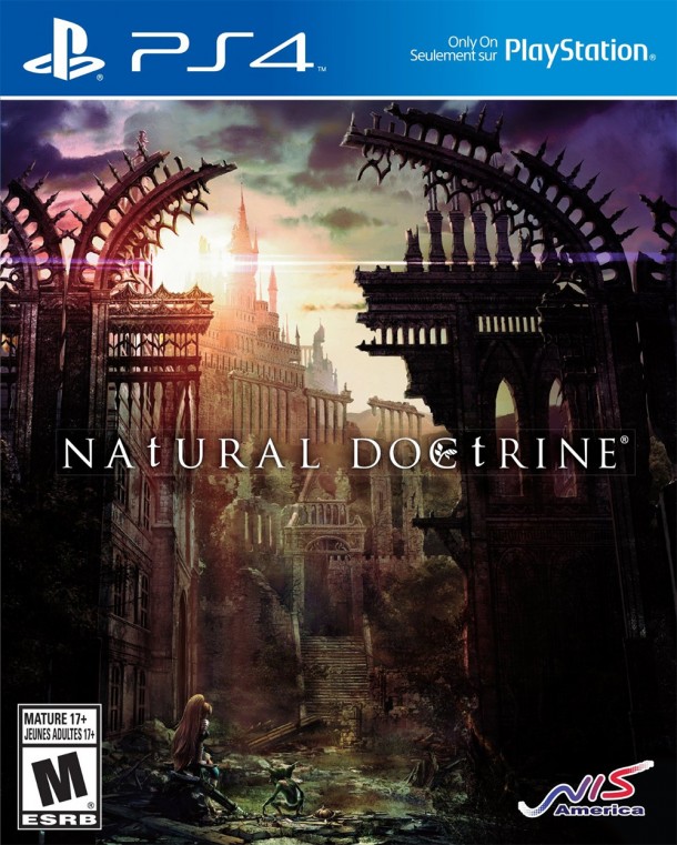
Natural Doctrine – Here’s a case of something pretty simple that I haven’t really talked about thus far. This cover might not hit many of the typical marketing notes, but you know what? It’s kind of pretty. And I like pretty things. I wasn’t at all familiar with this game before I saw this box art, and based on how much I liked it I researched the game and now I kind of want to play it. Good job Natural Doctrine!
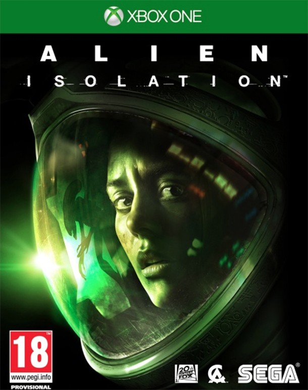
Alien: Isolation – There are so many ways that a good cover can go wrong that it’s actually kind of surprising when everything just sort of works in Isolation‘s design. The muted colors, the font choice, even the basic composition work together. Then, add in the not-too-subtle xenomorph image and the homage-style look, and BAM! you have some incredibly solid box art.
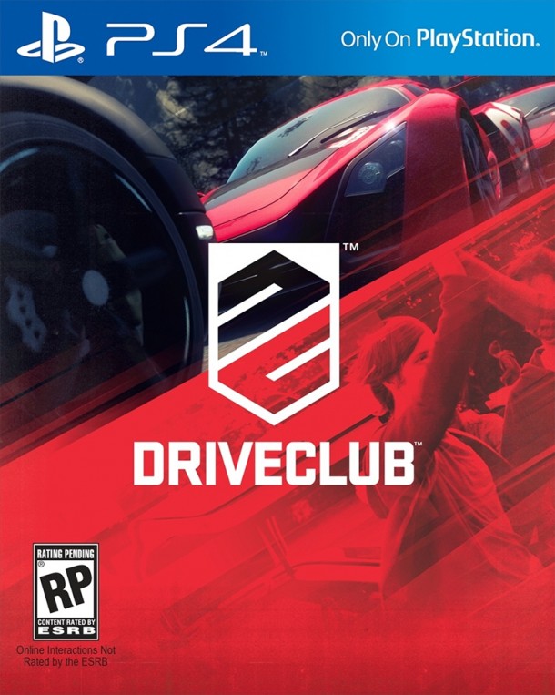
Driveclub – OHMYGOD the composition of this box art is just spot on! I even love the centered title treatment. The use of the near flat red on the bottom is just awesome. Having seen this on the shelf at Target, it almost always stands out. The only knock I have against it is the weird inclusion of a couple of bros high fiving? Who are these bros? Are they supposed to represent you and your friends? I feel like there should have been a better way to advertise the social hooks in this game other than “HEY CHECK OUT THESE FRIENDS HAVING A GREAT TIME!”
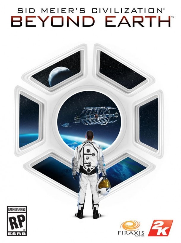
Civilization: Beyond Earth – Here is one person, standing alone, staring out at the infinite blackness of space. What a pretty minimalist way to not only be visually appealing, but advertise the whole point of your game: one person against infinite possiblities. Awesome.
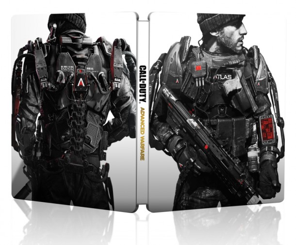
Call of Duty: Advanced Warfare Steelbook Edition – I could almost almost fill this list with all SteelBook cases, but I chose this one specifically because Call of Duty is never really that impressive in the box art department. I thought this was a pretty impressive way to showcase not only the “character” you will be playing throughout the game, but some of his augmented future tech.
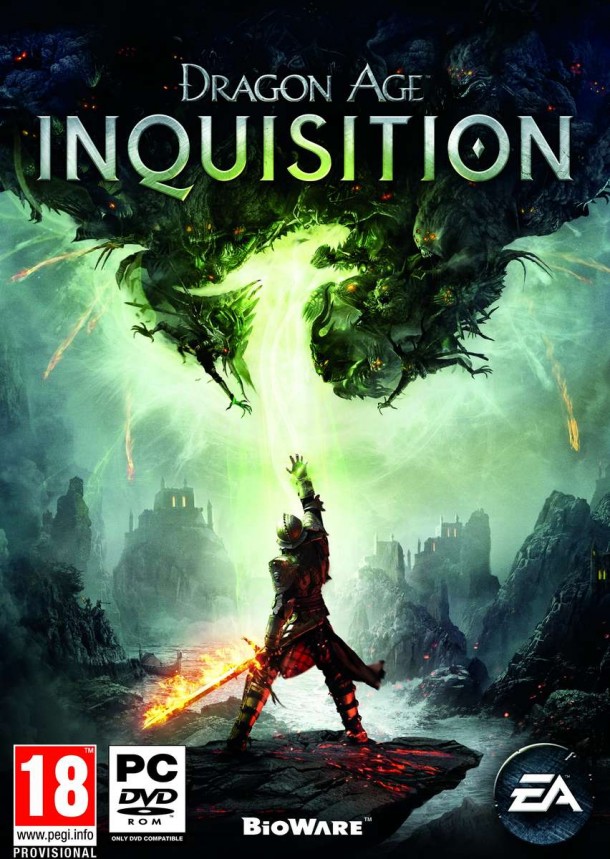
Dragon Age Inquisition – This could have easily fallen into the all too typical track of big hero protagonist shot, scattered with a couple side characters. Ho-hum. But EA went for it, and did something a little more interesting. Not only do you have this central, mysterious figure, but you have the shape of a dragon hidden in smoke, that is actually made up of hundreds of demons. It maybe laying it on a little thick, but it’s still pretty cool.
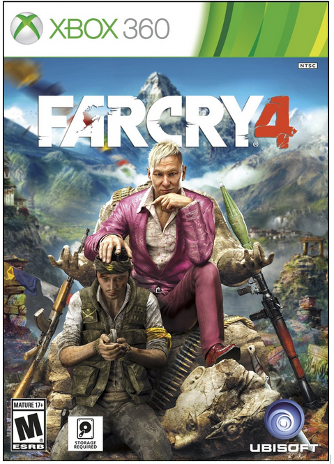
Far Cry 4 (Original box art) – It may not be the final design, but I’ll remember this box art for years. Thats all I’m going to say about it.
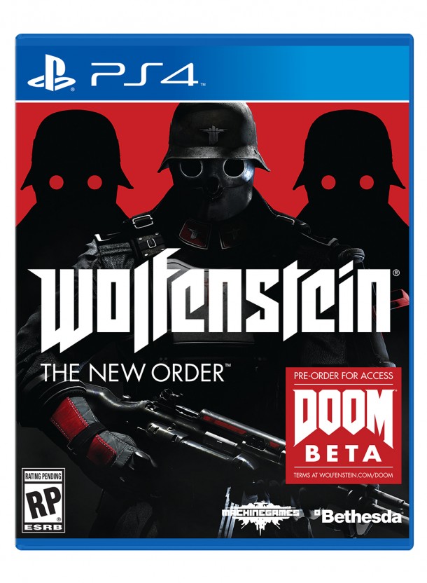
Wolfenstein: The New Order – Keep it simple. Make it striking. For a game that defied expectations in many ways, that theme was easily upheld with its box art. I love this. It makes me want to play the game and mess around in its world. Best of all, it doesn’t fall into the trap that minimalist artwork often does by layering a bit too much symbolism or little details. It just gives you the SS soldier, some heavy swaths of red, and the silhouetted soldiers behind him. Classic work.
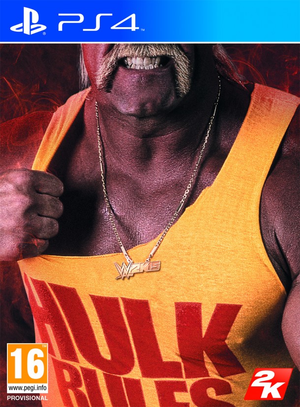
WWE 2K15 Hulkamania Edition – You know why this box art rules? Because Hulk Rules.
No Comments