
Here’s how it stacks up against PlayStation game packaging of the past
Video game packaging design is an art form. Sometimes you get amazing results, which can lead to beautiful pieces you’d want to hang on the wall. Other times you get Mega Man. Branding is an important part, and while the images on the cover might be good or bad, they still need to fit within the confines of a rectangle. That rectangle, which for the last 25+ years has been dedicated to disc-based media, carries the goal of identifying the platform that the game is played on.
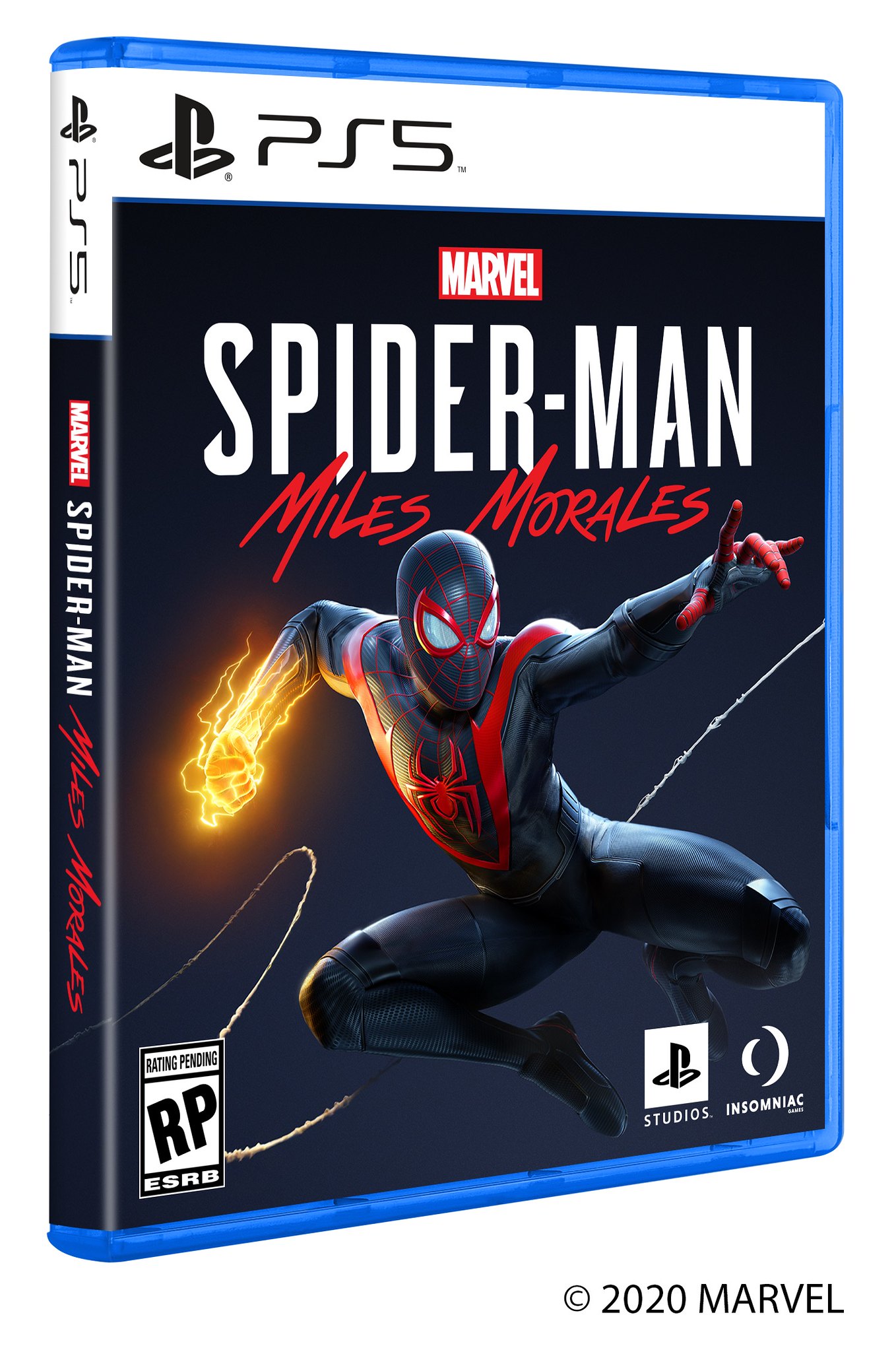
Sony took the wraps off of the PS5’s game package design yesterday, with the company revealing what we’ll see when Spider-man: Miles Morales hits store shelves later this year. Fans will notice right away that it doesn’t look all that different from what’s come before it.
The PS5’s box branding follows the design of the PS4 with very few differences. In fact, the biggest notable design change is the move away from a blue bar across the top to a white one, matching the exterior shell of the PS5’s console design.

So, how does it actually compare with box branding? How has it changed? Here, we’ve done a little homework for you and collected the major PlayStation box branding designs, using Spider-man games for accurate comparison.
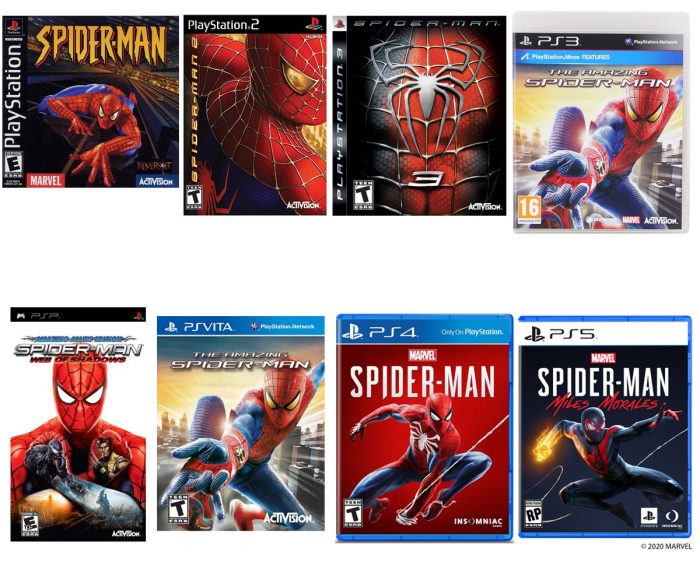
Apart from the first generation and the PS3’s launch titles, the PlayStation box branding has been pretty consistent, using a black bar across the top for everything prior to this latest console generation. The PS3’s second box art branding used the black bar with a subtle gradient and a red underline, and updated the font to the modern PlayStation typeface. The Vita and PS4 continued that style, keeping the typeface and gradient in the block, while switching the overall color to blue to push the Blu Ray branding — even the plastic packaging. There’s a subtle white underline in this block as well, to separate the zones. Finally with the PS5, the blue packaging returns but the title block has been changed to white to match the initial console design from the reveal and the type to black. And, for the first time in nearly 15 years, the underline is gone.
The final design may seem simplified, but that’s following the modern minimalism trend of “flat” graphic design that can be seen in mobile operating systems and web aesthetics.
No Comments