
Have you ever looked at the Nintendo Switch logo and thought: “huh, something seems slightly off.”
No?
Good, because there’s a reason for that. EVEN THOUGH IT IS SLIGHTLY OFF.
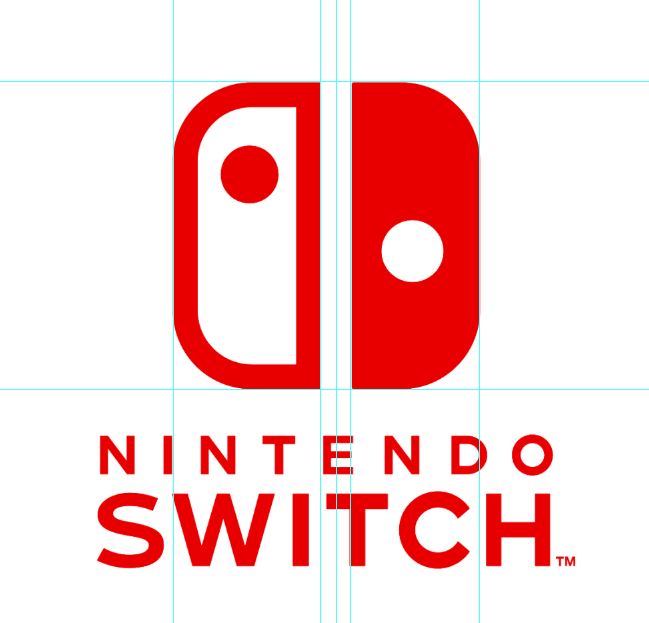
The Switch logo is actually asymmetrical, meaning that both halves of the design are not equal. The logo is designed to showcase the uniqueness that is the Joy-Con concept. It’s a neat way to showcase the two miniature controllers, and keeps the color scheme graphic enough where it’s easy to understand. But the concept for the logo is also surprisingly difficult to pull off.
In the image above, I took the artwork and created a centerline between the two Joy-Cons. Thanks, Photoshop. This lets us see where the middle of the two Joy-Cons is. Once the line is placed there, though, it immediately shows us that the Joy-Con on the right is actually narrower than the one on the left. In the image below I’ve slid the left side over on top of the right.
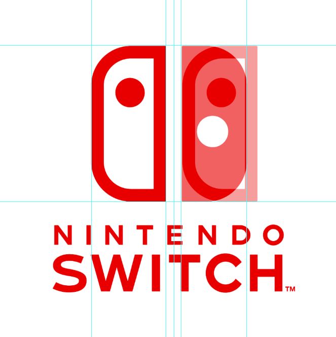
As you can see, it’s wider by the line width of the Joy-Con outline. Why? Well, the answer is quite simple, and it has to do with weight. The “visual weight” of the right Joy-Con is equal to the visual weight of the left, in that the red outline and the white space graphically average out to the width of the full red side. Or rather, had the full red Joy-Con been of equal size, it would visually look a lot heavier than that of the left’s and immediately draw your eyes to it.
The goal of a good logo is to purposefully guide the viewer to where the brand wants the eye to go. Nintendo wants to show the versatility of the Switch by having two Joy-Cons in the logo, but without forcing one side over the other. Although, it can be noted that because the console’s right Joy-Con has more tech inside of it and is sort of the main controller, the logo chose that side to be a full color block instead of an outline.
Either way, the current logo is an elegant solution to convey the idea. And, though it may just be my designer side nerding out over it, you’ll never see it the same again.
Asymmetry, baby.
Analysis images by: Dali Dimovski
No Comments